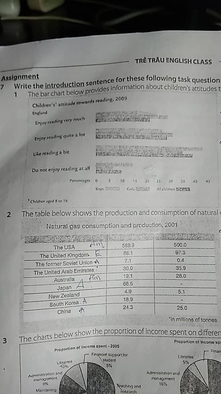
The horizontal bar chart plots the percentage of UK children, aged 8 to 16, according to how much they enjoy reading in 2009. There are four levels of enjoyment: very much, quite a lot, a bit and not at all. It also gives the same information for each gender, boys and girls.
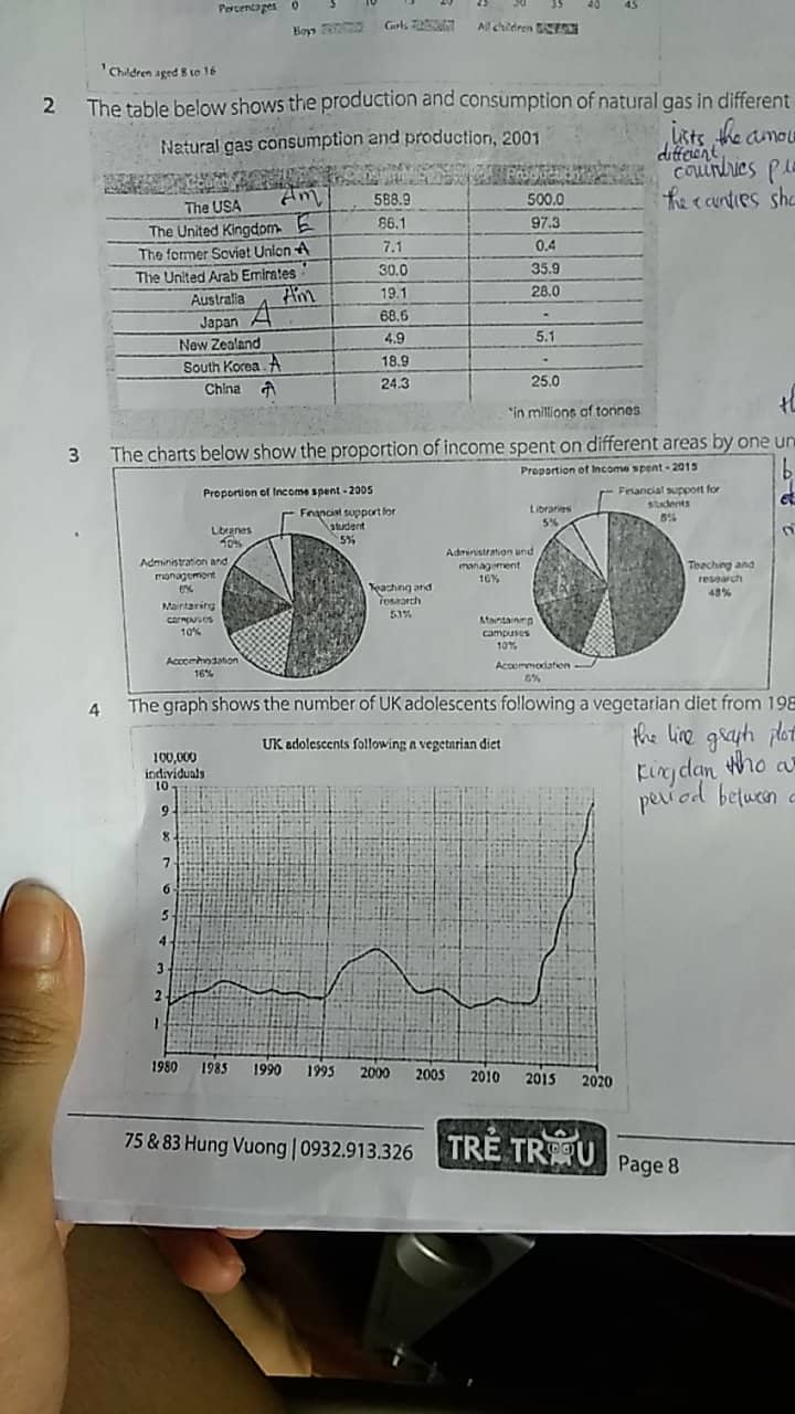
The table lists the amount of natural gas that eight different countries used and produced in 2001. The unit of measure is millions of tonnes. The countries shown are two in Oceania (Australia and New Zealand ), four in Asia (China, South Korean, Japan and the United Arab Emirates), one in Europe (The United Kingdom), one partly in Asia and partly in Europe (the former Soviet Union), and finally the United State.
The two pie charts, dated 2005 and 2015, break down the total income of a particular university into six different budget categories: student financial support, reaching and research, accommodation, maintaining campuses, administration and management, and libraries.
Can you give me some synonyms for these categories, please?
The line graph plots the number of UK youth who were vegetarians out of 100,000 people in the population sector over a 40-year period between 1980 and 2020.
thank you so much!