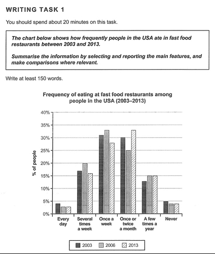
Test 7: The chart below shows how frequently people in the USA ate in fast food restaurants between 2003 and 2013
Introduction: The chart compares the six categories of American who have the meals in fast food luxury places during the period from 2003 to 2013
2 Likes
Torsten
2
he chart compares the six categories of Americans who had the meals in fast food luxury places during the period from between 2003 and 2013 *.
I’m not quite sure if there really are ‘fast food luxury places’.
1 Like
Thank you for your enthusiasm!!!
1 Like
