You should spend about 20 minutes on this task.
The graph below shows the quantities of goods transported in the UK between 1974 and 2002 by four different modes of transport.
Summarise the information by selecting and reporting the main features, and make comparisons where relevant.
Write at least 150 words.
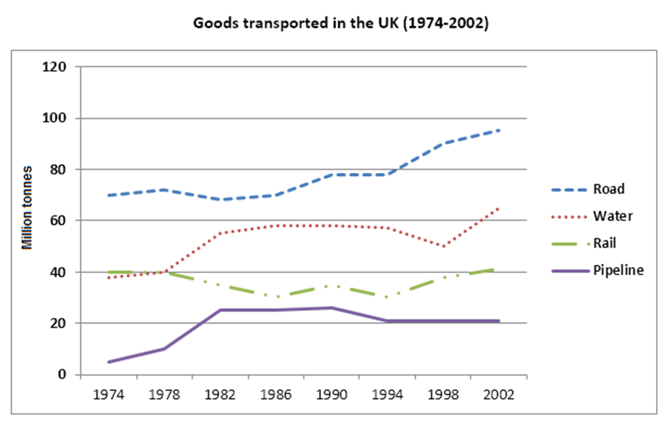
The below chart illustrates the number of goods (measured in million tonnes) transported during the period from 1974 to 2002 by road, water, rail and pipeline in the UK.
Overall, transportation made by road substantially increased during the period whereas transportation made by rail remained almost unchanged at the end of the period. The quantity of goods sported by water went up at the end of the period while the number of goods transported by pipeline rose at the end of the period.
The quantity of goods transported by road started with just above 70 million tonnes and underwent fluctuations during the period and hiked to just below 100 million tonnes at the end of the period. Transportation made by water began with just below 40 million tonnes in 1974 and reached its initial peak in 1982. From 1982 onwards it remained almost unchanged till1994. Then it decreased to less than 60 million tonnes in 1998 and reached its peak to above 60 million tonnes in 2002.
Transportation made by rail was just above 40 million tonnes in 1974. It underwent fluctuations and remained almost same with above 40 million tonnes at the end of the period in 2002. The quantity of goods transported by pipeline was above 0 million tonnes in 1974 and it went through many changes during the peak. It reached its peak in the year 1994. From 1994 onwards it remained plateaued till 2002 with above 20 million tonnes.