Written by Justin
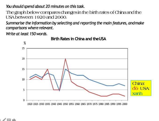
(Intro)The line graph describes generally the changes of birth rates in both nations China and the US from 1920 to 2000.
(Overview) As can be seen from the graph, China and the US experienced a fall in the birth rates during 80 years from 1920 to 2000. While these were not different in terms of a general decline, It is true that the percentage of the babies born in the US was significantly higher than China.
(Body 1) Over the 80 year period from 1920 to 1935, the birth ratio in America fluctuated aproximately 10%. However, in the next 10 years, the American birth rate reduced greatly to below 5%. In the 1950s, the proportion of the USA increased substantially to exactly 15%, which was its summit from 1920 to 1935. Throughout the rest of the period, there was a continuing fall in the US birth rate, which decreased to 7% by the year 2000.
(Body 2) Over the same period, the birth ratios in China differed more considerably than in the US. China has witnessed a slight decrease of 5% before reaching the peak of the whole graph, 20%, in 1950. However, after 5 years from that period, the birth rate in China fall unexpectedly by over 10%, continuing reducing to approximately 2% in 2000.
Hi, I think the format of your report is good and what you have written is pretty clear, but it seems like you have left out the most important features of the graph. The first main point is the steep decline in the birth rate of both countries in the 1940’s, caused by World War II, followed by a post-war baby boom in both countries. The second main point is that after the 1950 peak, the birth rate in both countries decreased, but this decrease was much more pronounced in China and for the second half of the 20th century, the birthrate of China was less than half that of the US. I think it important to state these overall trends and comparisons to allow the reader to better envision the graph.
Here are some other suggestions:
Dear Teacher,
would you please check my answer, and give me some feedback.
yours sincerely,
The chart shown below highlights statistics regarding the proportion of birth which is recorded in the United States and China, over an eighty-year period between 1920 and 2000.
Overall, what stands out of from the graph is that there is a striking resemblance in the trend of Chinese and US birth over the period. Also, it is clear that the sum of birth rate in the USA was significantly higher than China during the period of the question.
Turning to the detail, as regards the Chinese birth rate, the figure saw a considerable fluctuation over the half of the century. Starting at 10% in 1920, the figure increased slightly to 15% in the next 15 years. Following this, having dropped dramatically to 5% until 1945, the figure then recovered itself during the next five years, rocketing to 20% in 1950, when it experienced its highest rate over the century. At this point, the number of birth started dropping steadily year on year until the end of the period when it reached a low at somewhere in the vicinity of 3 percent in 2000.
As for the USA statistics, the proportion of birth remained fairly constant over the first twenty years, fluctuating between 11% and roughly 13 percent. After which, the figure plummet to just under 5% in 1945. However, same as the chines rate, the figure then recovered during the next five years and reached a high point at 15 percent. Subsequently, the proportion of the birth went down sustainably on each year afterward when it reached a minimum at just under 7% in 2000. It is also worth to mention that since 1950 the rate of birth in China witnessed a faster decline comparing to the same figure for the USA.