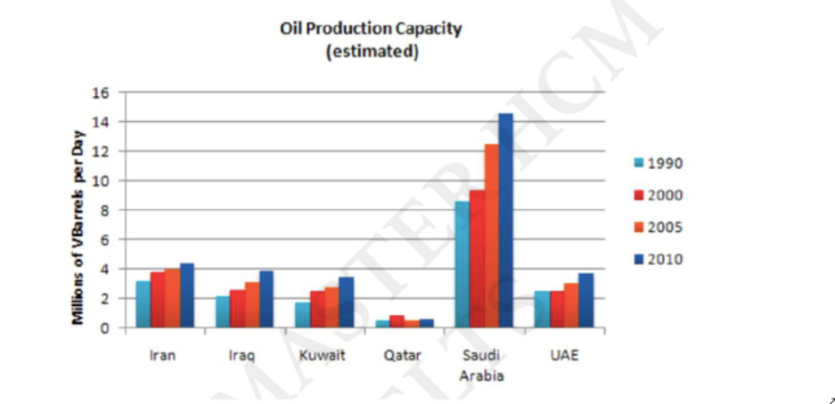
The bar chart compares six various contries in terms of the figure for oil production capacity between 1990 to 2010.
Overall, oil production increased during the period of 20-years. It is clear that Saudi Arabia produced oil higher than other countries, while the lowest was Qatar. In 1990, over 8 million of barrels a day was produced and rose steadily. Later 15 years, Saudi Arabia’s oil production witness a peak at around 14 million of barrel daily. By contrast, the year 2010 was saw a slight increase in the amount of oil production in Qatar, estimating around 1 millions of barrel daily in 2010.
From 1990 to 2010, oil production increased steadily in other 4 countries. The amount of oil production was around 3 millions of barrels per day in Iran, while the figure for 3 other countries at around 2 millions of its. In 2000, althouth there was a stability in the amount of oil production in UAE, the figure for oil production reaching a peak at over 4 millions of barrels daily in other 4 countries.
Hi, I thought your overall format was good, and it made sense to divide the six countries shown into two groups, as you have done. I think it is better to mention the other four countries in your summary, not just Qatar and Saudi Arabia. Watch out for your number terms - it is “five million barrels”.
It is the same for billion and thousand - six thousand bags of sugar - so be sure to get this correct. Most of your report was fairly clear, apart from the last sentence, which seemed factually inaccurate. Here are some specific suggestions: