My essay:
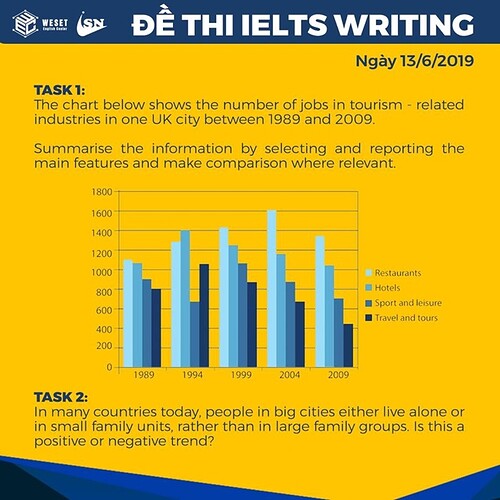
The numbers of jobs in four categories of the tourism sector in a particular city in the UK for five-year intervals between 1989 and 2009 are plotted on the bar chart. The job categories are restaurant workers, hotel staff, sport and leisure jobs, and employment in travel and tours.
Overall, except for 1994, the rank order was the same, with the restaurant sector employing the most workers, followed by hotels, sport and leisure, and then travel and tours. There were fewer jobs in the tourism industry in 2009 compared to 1989, as the rise in restaurants was more than offset by the drop in the other three.
In detail, the range of values among them was the smallest in 1989, with a 300 difference between the highest (1,100, restaurants) and the lowest (800, travel and tours). That was only nearly one-third of the highest, about 920 in 2004 when there were 1600 restaurant workers, the highest value on the chart. Generally, there were more hotel than travel and tour workers, but their patterns were highly correlated; both peaked in 1994, at 1400 and 1070 in 1994, respectively, and then decreased stepwise every five years, ending at 1050 and 470 staff. In contrast, hotel employment fell to its lowest point in 1994, from 900 to 670, before reaching its maximum in 1999 (1070). Since then, it had the same pattern, the end value being 700.
Thanks a lot!!
