Hi Luschen, here is my first attempt in writing task 1. Please give me some feedback. Many thanks in advance <3
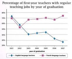
The line graph shows the variation in the percentage of early-year language teachers being recruited in Ontario during a six-year period from 2001 to 2007.
Overall, while the proportion of French-language teachers increased during the given period, the trend for English was the opposite.
In 2001, the percentage of French teacher was approximately 70%. In comparison, the figure for English was slightly higher, peaking at about 72%. The following year witnessed a downward trend in the recruitment rates of both language teachers. To specify, the percentages of English and French teachers reduced to about 58% and 52%, respectively. By 2003, the figure for French teachers slightly recovered and then remained stable at around 70% for three years, before reaching a peak at 75% in 2007. During the same period, the English teacher rate rose moderately in 2005 but then markedly decreased and fell to a trough of below 30% in 2007.
Hi Le Khoi, I think this is a pretty good effort. For task 1, coaches generally advise dividing your report into three paragraphs. The first paragraph will describe the chart and summarize the overall information. This summary should also give a clue as to how the other two paragraphs will be organized. There is a lot of flexibility. For a graph like this with two lines, often one paragraph will cover each line. The other option is to go chronologically, with the first paragraph covering one part of the time, and the second paragraph covering the rest of the time period shown. This is pretty much what you do, but you need to divide your paragraph at the point where the data seems to change. In this graph, the outstanding feature is that the two categories tracked each other very closely for the first two years, but then diverged widely over the remaining years of the period shown.
So you need to make that clear in your overall summary and that way it will be more clear to the reader what to expect in the two body paragraphs - the first two years in the first paragraph and the remaining time in the second paragraph. Another factor that made this example very difficult is that this graph is really showing the percentage of college graduates who landed teaching jobs. So the chart seems to be calling college graduates who majored in English or French “first-year teachers”, even if they never actually got a teaching job. To me the graph itself is a little unclear. You handled it pretty well, but I don’t think you can say “English fell and French rose” - you have to state what you mean by English and French - basically graduates who got jobs teaching English and French. Here are some other suggestions: