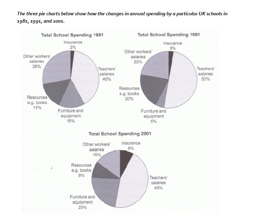
The three given pie charts illustrate the proportion of different expenditures of a particular UK school in three specific years, which are 1981, 1991 and 2001.
Overall, it is clear that the spending on teacher’s salary took up a large amount of school budget in these three years. By contrast, insurance is the smallest cost in each year.
In 1981, 40% of the school budget went to pay for the teacher’s salary. This number increases to 50% in 1991 and drop to 45% in 2001. For paying other worker’s salaries, it accounts for 28% in 1981 and decreases since then, in 1991, it’s drop to 22% and in 2001, it’s decline to 15%. In contrast, school spending for insurance is increasing in each year, in 1981, it’s account only for 2% but has increased to 3% in 1991 and in 2001, insurance has taken up for 8%.
Expenditure for resources such as books has a decent cost in the school budget, it’s account for 15% in 1981 and has increased to 20% in 1991, but it had a massive drop to 9%. Last is the cost for furniture and equipment, this cost in 1981 account for 15%, but has a big drop in 1991 at 5%, in 2001, this cost has increased back to 23% of the school budget.
Hi, your report seemed pretty well organized, but I never got a really good summary that said that teacher’s salaries stayed fairly constant and made up the largest proportion, while insurance costs increased, other salaries decreased and the two other categories fluctuated throughout the period shown. Also, all these years are in the past, so your entire report should be written in past tense. Besides that your report was fairly clear and did not have any inaccuracies. Here are some additional suggestions: