Hi everybody. I miss you. I am waiting your feedback and estimated Band Score.
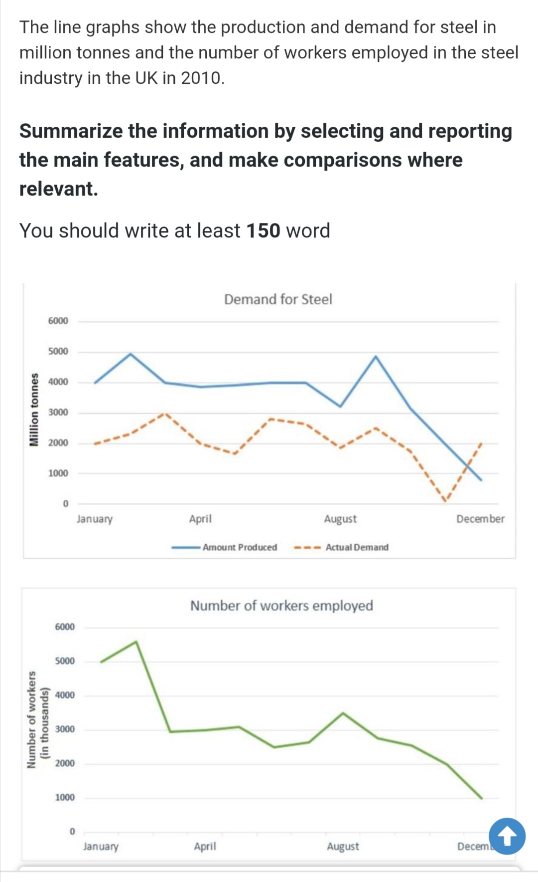
The line graphs give information about the generation and demand for steel in millions of tonnes and how many workers worked in the steel industry in the UK in the year 2010.
Overall, the steel was the most produced at the beginning of the period, while the amount produced of steel dramatically fell at the end of the period. Furthermore, numbers of the workers employed were the most in January, while the least in December.
Firstly, the amount of produced steel was 4000 million tones in January, where the figure experienced a dramatically decline in December just under 1000 million tones. Also, the number of actual demand was 2000 at the beginning of the period, while the figure was the same et the end of the period.
On the other hand, the number of employees accounted for 5000 of steel industry in January, before the figure peaked up at 5500. Then, the figure experienced a rapid decline to about 3000. After that, the number of workers fluctuated before it slightly decreased to 1000 in December.
Hi Memo, welcome back. I think your description of the graphs makes perfect sense and the British Council will probably you give you band 5 or even higher.
Let’s see what @tim_m and @Sumejja have to say about your efforts.
Hi @Memo34. Your essay looks pretty good. I agree with Torsten’s estimation of your Band score as well. I would just add that it may be worth adding some additional analysis to your essay. Particularly, you could bring attention to areas in the graph that stand out especially. For instance, December was the first and only time where actual demand was higher than the amount produced. Perhaps this could be due to the fact that the number of workers employed was also at an all time low. You’ll notice here that I referenced both graphs together to draw a connection between them. I think you could improve your overall score if you can go beyond simply reading the graphs and analyzing them for factual information. Rather, try to explain the human aspects of the information. What do the numbers say is actually going on here? Let me know your thoughts. Good luck to you.