Hi guys
kindly checking and editing my task 1 thanks
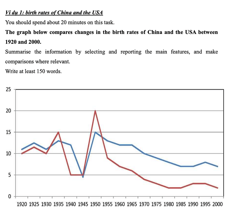
The given line graph illustrates how the proportion of live birth in China and the U.S were changed from 1920 to 2000.
The main point that can be observed here is that both nations experienced a fluctuating trend until 1950. Moreover, there was a significant decrease in the birth rates of China and the U.S
Looking at the graph more closely, the rate for the U.S.A waved within from approximately 10% to 20% reaching a peak of about 20% in 1955 which the proportion of birth in China recorded 15 % that year. After that, the U.S had an impressive decline from roughly 20% to 3% that was exceeded by the figure for China in the final year.
Moving into China, a fluctuating pattern was also seen from the rate for China by 1995, which 15 % of birth showed. In addition, the birth rate of China went down steadily from almost 15 % to 7% in 2000.